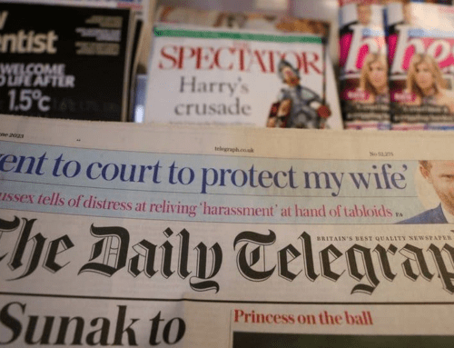
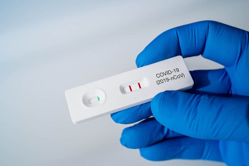
 Government Suspends Access to Confirmatory PCR Tests for Asymptomatic LFT Positives, Raising Fears of False Positives Consigning Thousands to Their Homes
 Back to Normal by February?
Does the Oxford Study on Post-Vaccine Myocarditis Underestimate the Risk?
There follows a guest post by Daily Sceptic reader ‘Amanuensis’, as he’s known in the comments section, who is an ex-academic and senior Government researcher/scientist with experience in the field (find his blog here). He has taken a closer look at the recent papers from Oxford University on post-vaccine myocarditis risk and has some concerns about the methodology they have used which he suspects may underestimate the risk.
A few days ago the Daily Sceptic published an article on the risks of post-vaccination myocarditis, taking data from a recent paper by Julia Hippisley-Cox of Oxford University. This is a hot topic as myocarditis appears to have become the poster-child of vaccine side effects in the young, and any scientific papers that attempt to quantify the risk of myocarditis seem to get rather a lot of attention. Hippisley-Cox’s recent paper is no different.
Unfortunately, Hippisley-Cox et al appears to have used its method of choice, the Self-Controlled Case Series (SCCS), inappropriately. This is a bit of a grand statement given that Julia Hippisley-Cox’s papers are published in Nature Medicine, a very reputable journal – I’ll explain why the method has been used inappropriately and perhaps you might agree with me.
The self-controlled case series experimental design is quite simple in concept – there’s always a risk in experiments that your experimental group (the ones that we did things to) are different from the control group (the ones that were left alone), so in SCCS you simply use the same people for the experiment group and control group. In this particular example the magic happens by allocating a time for the vaccine side effects and stating that outside of this time the vaccine risk was zero – thus each experimental participant automatically sits in both the control group and experimental group.
There’s a nuance in the way SCCS is done for the Covid vaccine trials, in that there’ll often be a period before each treatment that is set aside and not used in the data analysis – the stated reason for this is because ill people are less likely to get vaccinated. I’ll come back to this point later, but for now just remember that there’s a pre-vaccine period that is separated out from the other data.
So, just to get up to speed on the sort of thing that you’d see with SCCS, I’ve made up a ‘perfect example’ of how SCCS might be used. In the following graph the number of side effects are indicated by little red dots – there are a low level of side effects before vaccination which then increase during the week after vaccination and then a gradual return to the baseline:

It is important to remember that in the summary data that you’ll be presented in the scientific paper all you would see is the data represented by the black lines – the baseline, the pre-vaccine period and the post-vaccine period. Thus it is difficult to spot the actual distribution of the data within each time period. Sometimes you get some additional data within the side-effect period – I’ve indicated these additional data in the graph above with the green horizontal lines.
The other important point to remember about the above graph is that the baseline data is made up of both of the baseline periods – it isn’t given separately. Luckily, in the above example we can see that the time period for side effects looks to be about right, and thus the baseline appears to be accurate.
To summarise so far, I’ve invented some data that shows a side effect rate after a vaccine of about 25 events per day in the 21 days after vaccination, compared with a rate of about 7.5 events per day in the baseline and in the pre-vaccine period, resulting in an Incidence Risk Ratio (IRR) in the 21 days after vaccination of about 25/75, or 3.3 (shown on the right hand scale).
I’m sure that many can already see the complication with the SCCS methodology – it is vitally important that the study side-effect period is selected so that it is at least as long as the actual period in which you find the side effects. The impact of having too short a side-effect period is that you’ll get side effects bleeding into the baseline data. I’ve modified the first example data to show this effect:

In this example some of the parameters are the same – the baseline data before vaccination is about 7.5 events per day, as is that of the pre-vaccine period, and there’s an average of 25 events per day in the 21 days after vaccination. So far so good. The only difference this time is that the side effects continue into the baseline period after the 21 days allocated for the side effects to be identified; these later side effects have a pronounced impact on the baseline data.
In the above example, the bleeding of side effects into the post-vaccine baseline period increases the baseline to 15 from 7.5 – so, even though the actual number of side effects after the vaccine remains the same at about 25 events per day, the estimated IRR changes from about 3.3 (25/7.5) to about 1.7 (25/15). And all because we chose a too-short time period for the side-effects to occur.
Note that there are actually two impacts of this too-short a time period:
- The baseline is artificially higher, thus the risk appears lower than it should be
- Only some of the side effects are counted – any side effects occurring after the side effect period are ignored; this further lowers the estimate of side effect risk.
Of course, everyone should now be shouting ‘but that’s just because you deliberately chose a side-effect period of only 21 days’ – and you’d be absolutely right. Indeed, I made up this entire example just to illustrate the problem. Of course, science isn’t as simple as this – if you’re undertaking a trial to identify side effects, how would you know what side effect period to use before you’ve worked out that the side effects even exist? Really I should have first shown what is called a sensitivity analysis, where my assumptions were checked against the data – this would have highlighted that I’d made a mistake in my choice of side-effect window and made me rethink my assumptions.
Remember, in the scientific paper the only information you would get are the data for each of the black lines; you wouldn’t be able to see any of the underlying data (i.e., the red dots in the above examples). However, there are a few clues indicating that the side effects might be bleeding into the baseline:
- The first is that pre-vaccine period – this is included based on the assumption that people that have recently had a medical condition that’s the same as one of the vaccine’s known serious side-effects are less likely to be vaccinated. Thus the fact that there is a pre-vaccine difference isn’t quite a smoking gun – but nevertheless the presence of such a large difference in the pre-vaccine treatment period might raise suspicions.
- The second is any supplementary information on the change in risk during the side-effect period. I indicated these additional data in green in the graphs above. What you want to see is the risk declining to near the baseline during the latter part of the side effect period (as in example one above); suspicions would be raised if you had risk remaining flat during the side effect period; and alarm bells should ring if the risk appeared to increase during the side effect period (as in example two above).
That’s enough theory – what about the actual data?
I’m going to choose some data from the paper by Hippisley-Cox et al published on December 14th 2021 – “Risks of myocarditis, pericarditis, and cardiac arrhythmias associated with COVID-19 vaccination or SARS-CoV-2 infection“. Specifically, the risk to women from myocarditis after vaccination with the first dose of the Pfizer Covid vaccine:

Note that there’s no underlying data to help us see what is going on; all we have is the calculated IRR, and remember that the average for the baseline period includes both periods before and after the vaccine was given. So, the question is: does the graph above look more like the ‘good use of SCCS’ graph given at the start of this article, or more like the ‘poor use of self-controlled study design’ graph.
I think this data looks more like the ‘poor use of self-controlled study design’ graph – the inference is that there are side effects that continue into the second baseline period, resulting in the baseline being too high. The result of this would then flow through all of their subsequent analysis, making the vaccines look safer than they are.
What I’d really like to see is the sensitivity analysis of the choice of side effect period, so that we can see if it has introduced a problem – but this isn’t given in their paper. I believe that the ‘28 day period’ is arbitrary; they’ve simply used this time period in all of their vaccine side effect papers, presumably after deciding that it was ‘about right’. Alternatively, they could present the baseline data for before the first vaccine dose and all subsequent baseline data separately – this would immediately identify if there were side effect events bleeding into the baseline periods. Unfortunately the authors do neither.
Now, I picked a ‘good example’ in the above graph, so I’ll give another example that’s less clear – the risk of myocarditis in women under 40 after vaccination with the Pfizer vaccine, taken from the pre-print submitted by Hippisley-Cox et al on December 25th 2021, “Risk of myocarditis following sequential COVID-19 vaccinations by age and sex“. A few points before presenting the data. Firstly, the data covers a period from December 1st 2020 to November 15th 2021 and three vaccinations (and thus three pre-vaccination periods and three post vaccination baseline periods). The actual vaccination points will be variable within that period, so I’ll show their published data against a ‘typical vaccination schedule’ just for illustrative purposes. It is also important to note that Hippisley-Cox averaged all the pre-vaccine period data together, as well as all the baseline data.

Maybe not so clear now, but that’s the nature of experimental trials – sometimes the data aren’t obvious. However, I certainly wouldn’t like to say that the risks of post-vaccination myocarditis were definitely contained within the 28 days after each vaccine and looking at the above I’d think hard about my choice of experimental method.
I suggest that the recent papers by Hippisley-Cox et al on the risks of myocarditis are flawed in that they assume too short a period after each vaccination for side effects to occur, and that this incorrect assumption coupled with the use of the self-controlled study design is resulting in a significant underestimation of vaccine risk.
I also note that Hippisley-Cox et al have used this approach in previous analyses of risks of clot-related and neurological side-effects; analysis of their supplementary data suggests that for both of these papers the period allowed for vaccine related side effects was also likely to be too short, and probably also resulted in a significant underestimation of vaccine risk.
What disturbs isn’t that they’ve made a mistake – these things happen. What disturbs me is that this wasn’t picked up by the peer reviewers and that there’s been no discussion of these papers’ failings now that they’re published.
It also disturbs how difficult it appears to be to publish any trials and/or analysis that appear to show the vaccines in a bad light. For example, compare the negative press about the numerous trials into the use of Ivermectin, compared with the single trial supporting Pfizer’s Covid treatment Paxlovid which resulted in emergency authorisation being granted for its use by the NHS.
Finally, it also disturbs me that Hippisley-Cox’s two recent papers will now be taken as proof that myocarditis is rare and that anyone disputing this isn’t following the science. Science is different from religious dogma; challenge is part of its fundamental nature.