
Which Countries Fared Worst During the Pandemic?

As I noted on Monday, internationally comparable mortality data – specifically, estimates of life expectancy – are now available in most countries for the years 2020 and 2021. These allow us to see which countries fared worse and which fared best during the pandemic.
Unsurprisingly, the picture hasn’t changed much since all we had to go on was excess deaths. Still, the life expectancy estimates are easier to interpret and are therefore worth digging into.
The chart below plots life expectancy from 2000 to 2021 in three countries that represent the full spectrum of human mortality: Japan, India and Central African Republic.
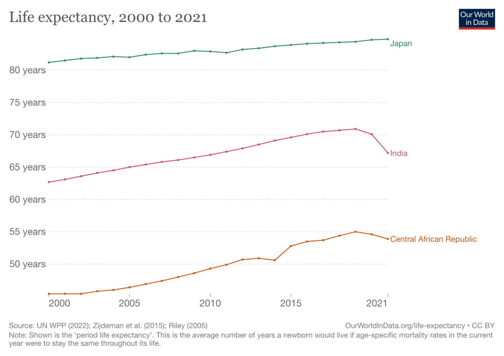

Interestingly, the pandemic had no discernible impact on Japanese life expectancy, which increased year-on-year in both 2020 and 2021. By contrast, Indian life expectancy fell by a total of 3.7 years. In Central African Republic, life expectancy fell by only 0.8 years.
Perusing the figures for a large number of countries, there seems to be a general pattern whereby middle-income countries like India saw larger declines in life expectancy than low-income countries like Central African Republic. In other words: high-income countries saw the smallest declines; low-income countries saw intermediate declines; and middle-income countries saw the largest declines.
The comparatively small declines seen in high-income countries are presumably due to factors like better healthcare systems and earlier vaccination of the elderly. But why the intermediate – as opposed to large – declines in low-income countries?
One possible explanation is that the data aren’t very good and a lot of deaths were simply missed. Another is that because Covid disproportionately targets the old, and there were fewer old people in these countries to begin with, the number at risk of dying was lower. A third explanation is that most low-income countries are concentrated in Africa, where the population may have higher levels of immunity.
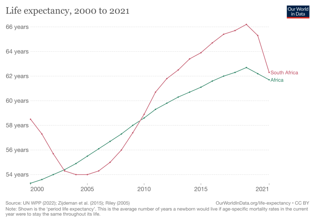

One reason to doubt the last explanation is that South Africa is in Africa, and it saw a much larger decline in life expectancy than the continent as a whole (shown above). Consistent with the second explanation, South Africa has a higher median age than most of its neighbours.
Contrary to some earlier evidence, particularly hard-hit countries from the middle-income bracket can be found on all four major continents, as the graph below indicates.
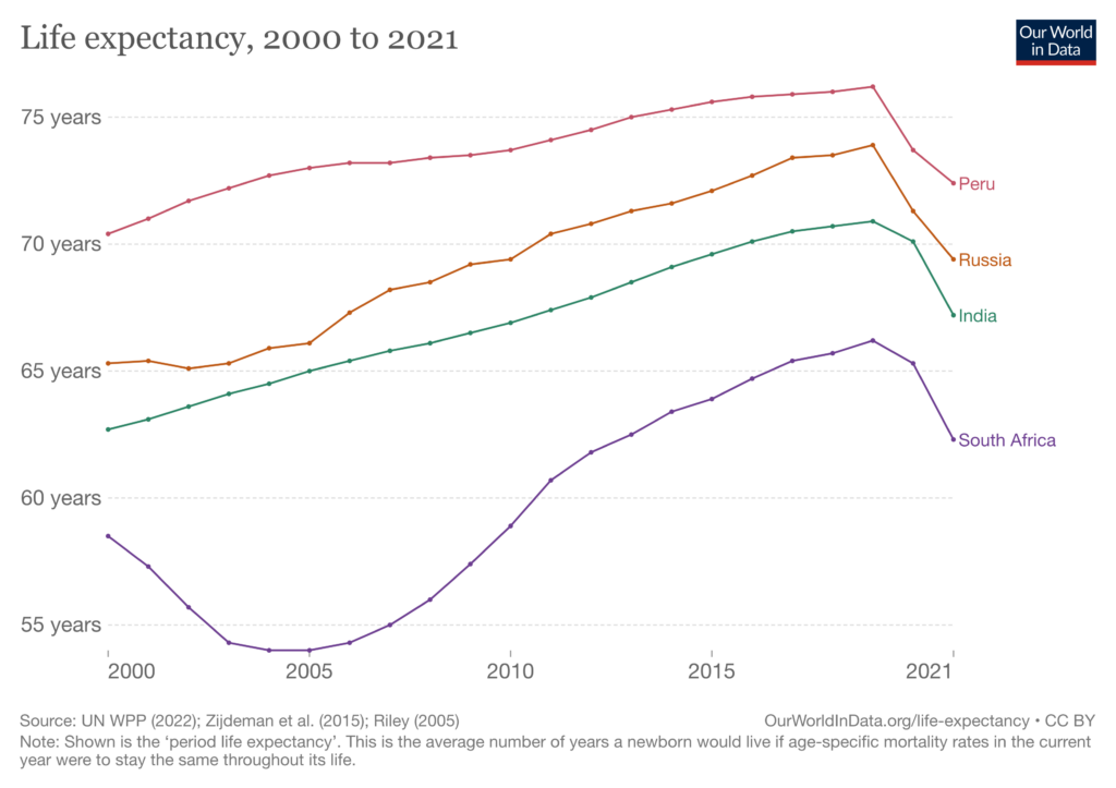

Unsurprisingly, high-income countries fared best during the pandemic. But interestingly, it was middle-income countries that fared worst; although this may be partly due to poor data quality in low-income countries.
Stop Press: Statistician Nigel Jacklin has looked at the European mortality date for 2017-22 and concludes there’s not much difference between the years 2017-19 and 2020-22. You can read his post on LinkedIn here.


