 More Inconvenient News on Global Temperatures From the Graph that Google Doesn’t Want You to See
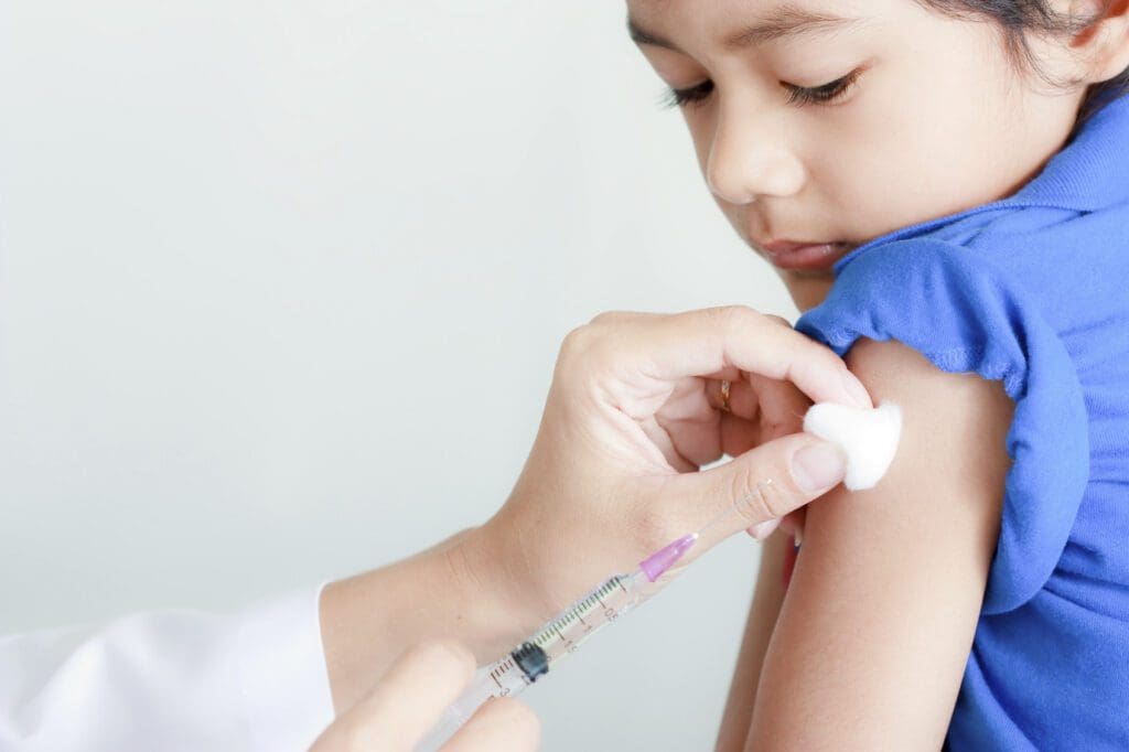 Why the Covid Vaccine Rollout in Children Should Be Stopped Immediately
SAGE Member Mark Woolhouse Was “Told to Correct His Views” After Criticising Witless and Unbalanced’s Infamous ‘Graph of Doom’
Senior epidemiologist and Government coronavirus adviser Professor Mark Woolhouse claims he was told to “correct” his views after he criticised what he thought was an “implausible” graph shown at an official briefing – Patrick Vallance and Chris Whitty’s notorious Graph of Doom from September 21st 2020. Sky News has the story.
The Edinburgh University academic is deeply critical of the use of lockdown measures and says “plain common sense” was a “casualty of the crisis”.
Speaking to Sky News, Prof Woolhouse seemed concerned about a possible “big-brother” approach to the control of information about Covid.
He says he was told to watch what he was saying following a briefing given by Chief Scientific Adviser (CSA) Sir Patrick Vallance on September 21st 2020.
Sir Patrick said at the time: “At the moment, we think that the epidemic is doubling roughly every seven days.”
Fifty thousand cases a day were being predicted by mid-October.
“There was a lot wrong with the projection,” Prof Woolhouse says. He calculated the doubling period as every 10 or 11 days, rather than seven, and, in his opinion, there was “no reason to expect the epidemic to accelerate suddenly”.
He observes: “If this projection had been extended for another week we would be talking about one hundred thousand cases per day. Another month would have given us close to half a million. Per day. An exponential projection will give you any number you like if you run it for long enough.”
Prof Woolhouse felt the predictions were “so implausible” that he was concerned about a loss of scientific “credibility”.
After seeing the graph, he says he “quickly posted what was intended to be a reassuring comment through the Science Media Centre saying it was highly unlikely that the U.K. would see so many reported cases per day by mid-October”.
“As it turned out, we barely reached half that,” he says in his new book on the pandemic called The Year the World Went Mad.
However, his “objections did not go down well”.
“After a flurry of emails I was invited to ‘correct’ my comments,” he says.
“The invitation was passed on to me by a messenger so I cannot be sure precisely where in the system it originated.”
Nor did not end there, he says. “A couple of weeks later I was asked to give evidence to a House of Commons Select Committee. This generated another flurry of emails over an October weekend from two senior Government scientists concerned that I might criticise the CSA’s graph before the MPs.”
When asked where the message telling him to “correct his views” came from, he says he simply doesn’t know the source, but it was “not from a random person”.
Clearly angry, he insists it “wasn’t my views that needed correcting, it was the projections”.
Then almost the exact same thing happened at the end of October, he says, ahead of the November lockdown.
The article includes a number of other fascinating and revealing anecdotes from Prof Woolhouse’s book and is worth reading in full.